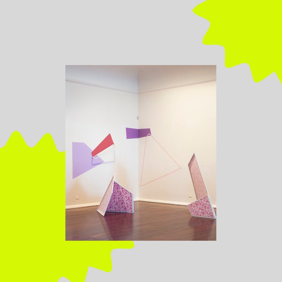
Window Gallery x Renee Kire
Minimalism, shapes and subversion
IN-FORM is our monthly podcast about local emerging arts practices and the critical conversations that surround our contemporary arts ecology. In today's episode, we’re joined by Renee Kire, one of our 2023 Outer Space Window Gallery artists, whose work Shifting Perspectives is on show from April 12 to 15 May.
This episode was hosted by Outer Space Promotions Officer, Tess Bakharia.
Renee Kire is a sculptor and installation-based artist living and working in Meanjin/Brisbane. Her practice aims to respond to the historical feminine and masculine dichotomy within visual arts by occupying space in untraditional ways. Often feminizing harsh geometric forms through patternation, adaptability, and evidence of the handmade; she uses material investigation to reject the static qualities of conventional sculpture.
In 2022, Kire graduated with Honours in Visual Arts from the Queensland College of Art, where she also previously completed her undergrad with a double major of sculpture/ jewellery and small objects. Solo exhibitions include L in the chat at Grey Street Gallery 2022 and Be there or be square at Metro Arts 2023. Kire has participated in a number of group shows across Australia, in venues such as Brisbane Powerhouse, Buxton Contemporary, PICA, Artisan, and Pop Gallery.
TB: Hi, Renee, thank you so much for joining us today. I'd like to start by acknowledging the Traditional Owners and custodians of the land on which my meeting today the Turrbal and Yuggera peoples and pay respects to Elders past, present and emerging, as well as the Traditional Owners of the lands on which our listeners are listening from. It's lovely to have you here today and to chat more with you about your work Shifting Perspectives, which is the second work in our 2023 Outer Space Window Gallery program, which is focused on showcasing emerging artists. Would you like to start off by telling us a bit about your practice?
RK: Thanks for having me Tess. So I'm a sculptor and installation-based artist. My overall practice aims to address gender issues within the arts and find unique ways to occupy space in untraditional ways. I do this by addressing gender topics, through sculptural objects, and not through a traditional text based practice. I predominantly create large-scale sculptural objects influenced by work developed by women from the Minimalist art movement, such as Judy Chicago and Anne Truitt. I've more recently started developing installation-based work, which contain flat, coloured, geometric planes and sculptural framing, which is what is currently on show in Outer Space's Window Gallery.
TB: You mentioned your installation-based practice, can you talk a little bit about the different materials that you use to construct your work generally, and how you find these change the work's effect on the viewer?
RK: I work with a variety of different materials ranging from wood, metal, fabric, and paints and I fabricate everything by hand. So I feel as though myself is kind of immersing in the making experience. And I always like to kind of highlight the imperfections in the materials I'm using, as I feel like it gives the viewer a more comforting viewing experience as they've kind of been handmade. And you can tell they've been handmade.
TB: Just going on from that, what's a typical day in the studio for you, like how do you go about constructing one of these works?
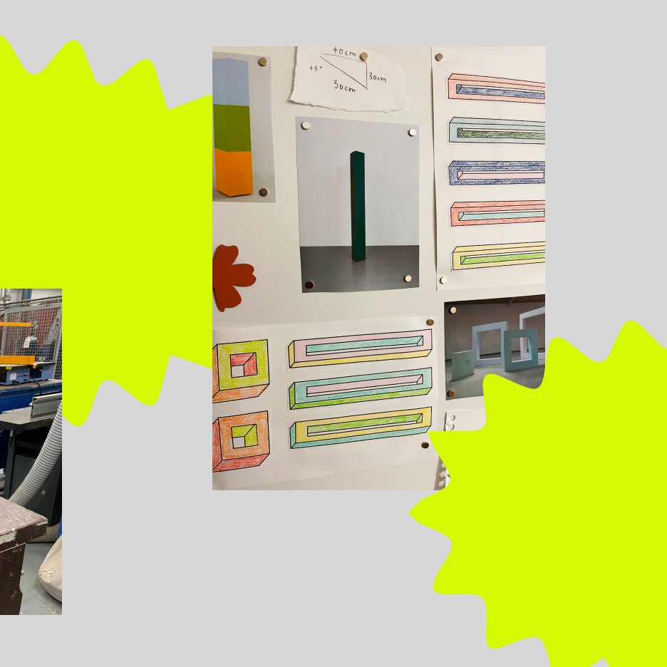
RK: Yep. So my works usually bounce from one another. So if I'm making a sculptural object, it's a lot of the mapping out. I don't like to sketch things. I usually like to just immerse myself with the material. So it's usually sketching on the material and then cutting out from there.
TB: Cool. Yeah. Interesting. And how long does it usually take to put together one of these works?
RK: It depends if I'm having a good studio day or a bad day. Sometimes it can take, like, for example, my sculptural objects they can take a week or they could take a day, it just depends on how the material's working and how well I'm using the tools on that day. But these more installation based works, there's a lot of prep beforehand but the works never kind of turn out how I envision them. But they usually take kind of a day or so. For the work at Outer Space at the moment, it was like a six hour process of just walking back and forth from the street into the the window space to see how the elements work. Yeah.
TB: I think that's interesting that you talk about the relatability. And I guess my question to follow on from that is, how do you see the vinyl that you used in the window gallery to play into that?
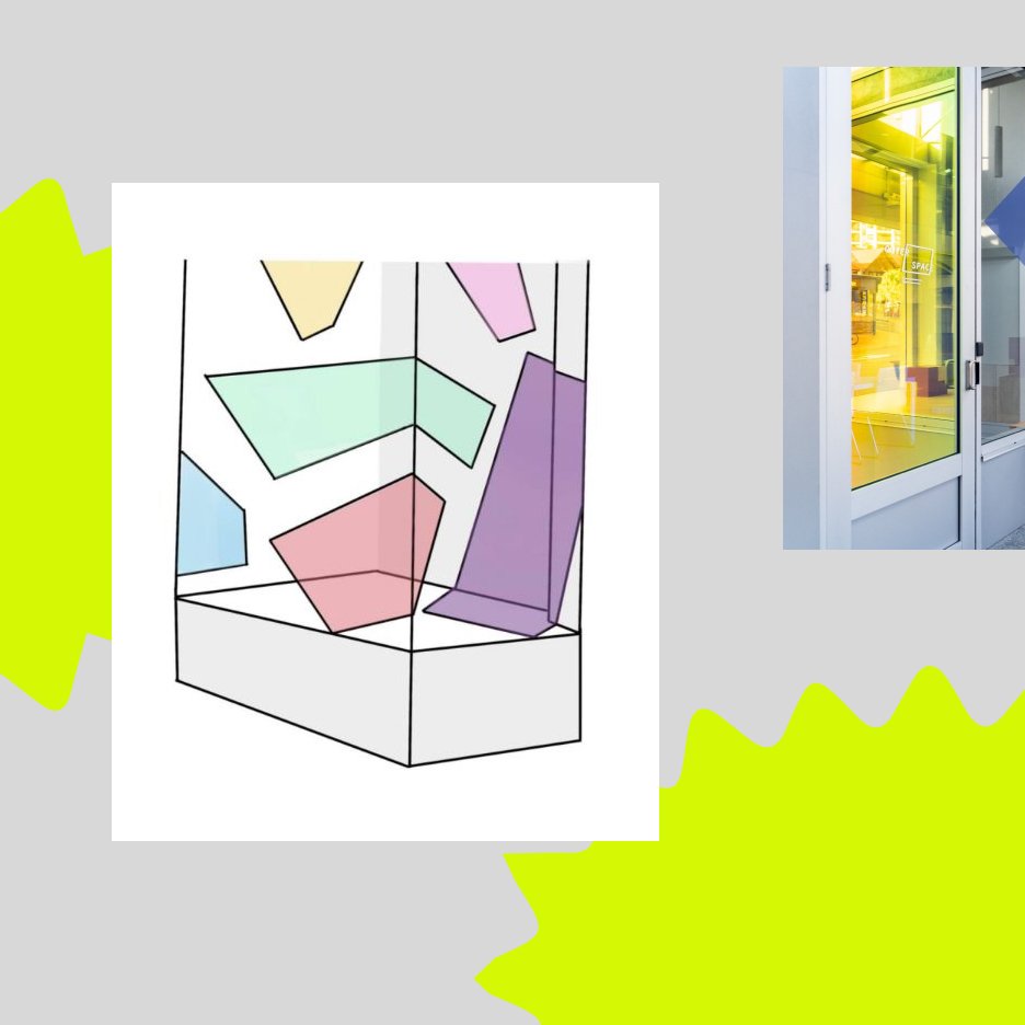
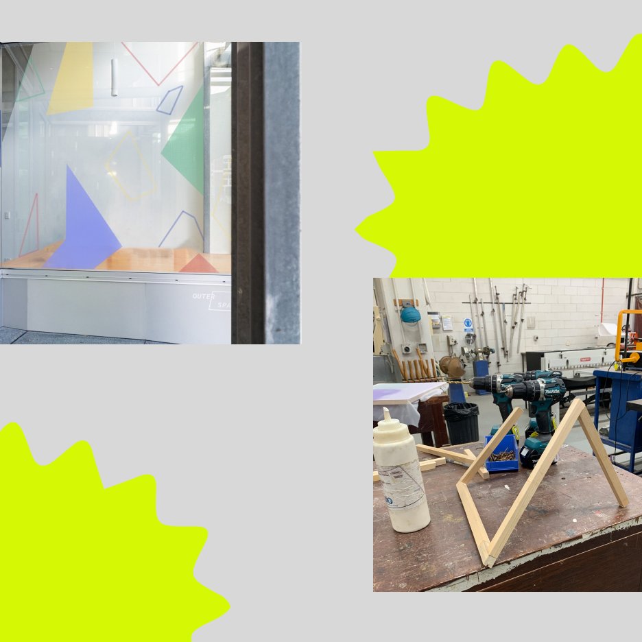
RK: Yeah, so I predominantly work with paints. But for the space, specifically, I wanted to kind of utilise the windows in the space, so that's why I made the switch from paint to vinyl. Which they have very similar aesthetic qualities but the vinyl is so much more easier to work with, because you're able to kind of cut these shapes out and then move them around the space to get the correct positioning of the shapes. Yeah,
TB: Yeah and I think when you move from vinyl to paint, how do you see that as changing your installation process? For example, when you're using paint, you sort of have to build up a shape. Whereas with vinyl, you say you cut it out, and then you've got that shape ready to put on the wall. So how does that change?
RK: So the vinyl is a lot more forgiving than paint because with paint, you kind of have to have the foundation set and then paint. And then if I'm wanting to change anything of that, it's like hours of patching up. But they still take around the same time, because cutting the vinyl is a lot, since I haven't worked with vinyl before, I was cutting everything by hand. So it's very, it's a very different texture to paper. So I found the stanley knife was kind of slipping a lot. So it was a very slow process. But I think aesthetically, the paint and vinyl are quite similar.
TB: Yeah.
RK: But the vinyl has a more finished look to it. And it's a lot softer on the eyes, as opposed to paint, which you have to layer up to get that pigment you're after.
TB: Yeah, and I think when you look at the gallery, it's not immediately clear whether it is paint or vinyl. So I think you've really achieved that effect of, you know leaning into those qualities of paint, while still having an material that's more easy to apply. It's interesting as well, that you mention like, I think the qualities of your work are that they're so crisp, and with cutting the vinyl and having to navigate those difficulties of the knife slipping and working against the tendency of the material to be less crisp. And making a crisp shape out of that is really interesting.
RK: That was a very hands on process, which is what I enjoy doing, as I like to immerse myself in the making process, because I feel like it kind of leads on to different kind of opportunities within the work. Because it's such a new development for me. Because I've only started recently, I think it's been like a year and a bit since I've started doing these painted elements. So I'm kind of as I'm going, I'm learning these new techniques along the way to kind of help me make the works better.
TB: And do you feel like because you spend so much time carefully putting the works together that changes the outcome for you? Like, do you feel more connected to it because of that?
RK: Yeah, 100% I feel like by the end of the day, I'm so proud of what I've made. And spending all that time with the work you kind of get this kind of relationship going with it. Which kind of sad because like after the month is done, you just rip it off the wall, because then never the same when I make them. Yeah,
TB: I think that's a really interesting point that you raise about your work that it is so temporary, and that it morphs every time you install it. I think going off that, did you want to talk a little bit about how the process of installation changes the work and how the work evolves as you are installing it yet.
RK: So when I come into a space, I have a general idea of what the work will look like but it never turns out how I imagined it because of the environment I'm in. And the forms throughout this installation were influenced by the architecture in the gallery. And each shape kind of informed the next. So this installation was a six hour process. And it was a lot of walking back and forth onto the street, seeing how I as a viewer would interact with the work because you're kind of restricted by this glass window. So it's kind of a lot of walking back and forth to kind of make sure the viewer is getting an immersive experience and it's not being blocked off by oncoming traffic opposed to like a traditional gallery, where you have one of these like accessibility issues.
TB: And I think that's interesting that the experience of viewing the gallery became such a large part of your install process. Because that is as you say, such a unique characteristic part of the window gallery is that it has that glass and you can't interact through the glass so you have to sort of move around outside to sort of find a way to engage with the work through the barrier. As evident in the title Shifting Perspectives, your work plays into the way viewers observe the work. Do you want to talk a little bit more about how you felt that the Window Gallery enhanced those qualities of your work?
RK: Yep. So with the gallery, I find it's more approachable for the everyday viewer to kind of view as they're not having to kind of go out of their comfort zone and enter a traditional gallery, as they're kind of forced to view the work on the street, which I think is quite a unique viewing experience for them. So I always purposefully not published the documentation of the completed forms online, as the experience is best viewed in person. So it kind of limits what people can view, as if they don't see it in person, then they kind of miss out on the experience.
TB: Yeah and for example, we've seen Louis's documentation. So beautiful. But as you say, That's Louis' perspective of the work and those are certain frames that he's decided to highlight. Yeah. So I guess in that way, when you see the documentation, you don't get that full moving experience, it's very different to how you would experience it, if you were walking along the street.
RK: Yes, and with the colors used in this installation, they're very eye catching. And whilst I was installing the work in the space, I viewed a lot of people kind of stopping to see what was going on. So it was very interesting kind of working in that confined space.
TB: And I think the nature of the window itself, it leans into that sort of voyeuristic tendency that people have, and I'm sure it's a experience that everyone can relate to when you're walking down the street, and you sort of your eyes wander around, and you sort of look into different windows. And yeah, I think you're right, the colors are so bold, that it really draws you in and sort of to look closer and sort of examine what you're seeing. You mentioned before, about that aspect of the window, that it forces people to view the work without engaging with a typical art gallery, they just can see it from the street. And I guess your work sort of is bordering on that sort of public art space.
RK: Yeah.
TB: What do you think about that sort of space?
RK: So public art is something I've always wanted to get into. But since I'm so emerging, it's kind of finding the funding for it and the people to back me. But it's been nice having these opportunities, explore these ideas I have in my mind,
TB: Yeah, if you have a look at Renee's other projects in other galleries, you'll notice that you're very clever in choosing spaces that lean into that public art. For example, the one at Metro as well had this sort of window. And obviously ours is street facing. So do you choose that? Or is that sort of coming more from the gallery saying this is a space we have, we think you'd be good for it? Or do you find those spaces.
RK: So with my show at Metro, I was approached for a work I had during my undergrad, and they were quite interested in the wall elements I had, and they had an opening for the Window Gallery, which is why I kind of took that opportunity. But for Outer Space, I kind of proposed this idea I had, and they were on board with it. So then that's how this kind of installation came about.
TB: Do you see your work always living in these window type spaces? Or do you have any other ideas of other spaces that it might suit as well?
RK: Yeah, so I feel like these works are so versatile. And they're in such like an emerging space. I feel like there's so many different possibilities they can take. Like at the moment, I'm brainstorming ways I can kind of use these shapes to occupy a whole gallery and kind of have people walking through the space and interacting with them.
TB: It's very like Yayoi Kusama.
RK: Yeah.
TB: You know, that sort of like immersive. And that's interesting, because that's kind of the opposite of the Window Gallery.
RK: Because I usually like how people can walk through my work and kind of view the different elements, but they're kind of confined behind the glass wall and they can't get a kind of intimate viewing experience, which I quite enjoyed with the space.
TB: And I think that's, it's drawing a really nice delineation in your practice between these works that exist so closed off from the audience, and then these other works that are so open to the audience. I think that's really interesting how you've sort of attacked both sides of that coin, which is really cool. Let's just jump now, back to the start. You mentioned that your work is influenced by Minimalist sculpture. Can you talk a bit more about how you use your work to challenge the traditional notions of Minimalism, I'm interested to hear more?
RK: So my overall kind of practice on an aesthetic level connects to the Minimalist sculptures of late 1960s. But I produced everything by hand without the use of heavy machinery and do my best to kind of highlight my maker's mark, because I like myself to be viewable in the work, because I don't like to make perfect objects, because that's something I've always kind of been against. Because it's not made by machine. It's made by me. And it's kind of my way to kind of reject these traditional rules created by these men from this movement.
TB: Can you talk a little bit more for anyone who's not familiar about these Minimalist works from the 60s?
RK: Yeah, so they're very brutalist. And they're very stark, and unapproachable because they're quite large and manmade, which is kind of the aesthetic that we're going for it at the time. But I kind of take those words and kind of twist it around. And I kind of like to soften the forms I make by through colour, and texture and I kind of introduced deliberate feminine connotations into the work, to really evoke kind of these notions that they created, to kind of talk about the overlooking of female artists from that movement.
TB: Yeah, I think that's a really interesting part of your practice. I noticed these were particularly evident qualities in your work, She sought solace in the field. Yeah. Do you want to talk a little bit more about how you see these qualities playing out in your Window Gallery work, and why they're important for your work?
RK: Yeah. So the elements in She sought solace in the field was during COVID so I was quite restricted to the materials I had, because I made a lot of my work at home. But the kinds of forms that you see in that work had been translated into the painted elements. Because in She sought solace in the field, I had two sculptural objects at the front of the work, and I had some painted elements at the back. But they were always kind of a secondary thought. But with these works, the kind of painted elements have become the forefront because people engage with them so uniquely.
TB: There's such a contrast between your sort of subversion of these masculine notions of Minimalist art and the way that you're sort of trying to combat them through these different strategies. But it's really interesting to me, I think that you still make the works so geometric and bold, it's almost like a subtle subversion that you do, like, you're still working in that area but you're actively trying to dismantle those preconceived notions as well.
RK: Yeah, and I feel like the work at Outer Space the moment is picking up a lot on Constructivism. And it's very propaganda theory, which is, I'm kind of excited to explore a little bit more.
TB: Why is that?
RK: I think it's the way the kind of composition is compared to kind of your traditional propaganda from Constructivism at the time. It's very geometric, the kind of layering with the window, the shapes on the window, and the background on the wall,
TB: Those triangles as well are really referencing
RK: And the color palette in this one, too, is interesting, because I usually go for a flatter pastel palette.
TB: You do.
RK: But with vinyl, you can't get access to those sorts of colors. So I kind of went with very a primary palette, which I think benefited the space a lot, because it's very eye catching.
TB: Yeah, definitely. Yeah. And that's interesting that you're sort of picking up on vinyl posing some limitations to your process and I guess with paint, you don't have those same colour limitations but then you have other limitations, as you say, you got to built it up...
RK: You've got to stick to the one, you've got to stay to the walls. Yeah.
TB: Exactly. Yeah. Well, now you mentioned that we sort of discussed in the process of you formulating this work, how it could add some 3D elements that came off the floor and off the wall. Can you talk a little bit about how you use those and what you think they add to the work?
RK: Yeah, so I feel like I add a lot of 3D elements to my work like sculptural objects. For instance, I have like a geometric triangular form kind of coming out of the ground in the space, which I think adds something visually different, as opposed to kind of the vinyl being on a flat surface. And it kind of plays with the viewers kind of vision too.
TB: Yeah, it does. And you expect the work to be completely flat off first glance, and then as you look more into it, sort of like emerges up.
RK: Yeah, it's kind of protruding off a different plane which I think is quite interesting, especially for the Window Gallery, because as you're walking past the gallery, everything kind of shifts. And you get to see all these new perspectives.
TB: Yeah, yeah. It's very, very cool. You talk about your work as rejecting the static qualities of conventional sculpture. You've obviously mentioned how you do this through employing different perspectives and the work changes as you walk around it. Do you think that there's any other ways that you do this in the work? And do you want to talk a little bit more about your reasoning behind wanting to do that?
RK: Yeah, so with my sculptural objects and installations, I kind of like the viewer to be a part of the work, as opposed to kind of traditional Minimalist sculptures, they're kind of just there in the space, and they're not interacting with the viewer as they're so stark and brutalist. So I kind of like to have, kind of thinking of a new way that the viewer can engage with work in a contemporary way. So that's why I kind of have these elements where the viewer hast be involved in the work to kind of complete the work, and it kind of dissolves those static qualities as they're required for the work to be complete.
TB: I'm interested to know where your interest in Minimalism originated from.
RK: So I've always been interested in like simplistic figures, and kind of going through art school, it was what I kind of was drawn to. And I was quite restricted with the way I was making things as I made a lot of kind of things that could detach from one another or kind of fold up, which is something that Minimalist sculpture didn't do. So during my Honours year, I started kind of wanting to, the term I'm calling it is kind of 'occupied space for those who didn't get the opportunity to do so'. Like these female artists who kind of missed out on showing their work because of their gender. I'm kind of using my practice to kind of shed light on their practices.
TB: It's very interesting. And you're right, you're like holding the space open to sort of refer back to them. And reference.
RK: Because I reference a lot of Minimalist female artists, like for instance, Anne Truitt is very kind of influential to the forms, sculptural forms I've been making, because I started off by kind of researching her solid column. And then I started thinking about how I could kind of transform this to a more contemporary audience. So that's why with my sculptural objects, they kind of start curving and bending in un-traditional ways.
TB: Can you talk a little bit more about why they sort of bend or what drew you to that?
RK: Yeah, so it was kind of my way to kind of revolt against traditional notions of the movements, but still kind of be within that realm, because they're still Minimalist sculptures but you can kind of see evidence of me within them. And I was just kind of seeing how far I could push these materials, because they're all made from wood. But I'm doing it all by hand. So I was kind of seeing how far I can push these materials, how far I can bend them before they snap,
TB: Was that difficult to bend them?
RK: It was very hands on. It was a labor of love making them but I feel like as I kind of made one I kind of gained new skills, and they kind of bounced off one another to make a whole series.
TB: Cool. Yeah. I wanted to ask you more about your recent exhibition at Metro Arts. How did that experience of installing in that window space inform your Window Gallery exhibition at Outer Space?
RK: Yes. So I kind of, the colours at Metro were quite soft on the eyes. And I found it was quite hard to view the wall works, because of their blurring into one another with that paint. So when switching to the work at Outer Space, I kind of went for those brighter colors, that kind of contrasted against one another so it was easier on the eyes and for people to view.
TB: We've talked about your previous endeavors into this space. But what do you see the work transforming into going forward?
RK: Yeah, so I feel like these works are going to be forever evolving. And like I previously touched on, I'm wanting to kind of experiment with the public art realm, and kind of making these very large and having people walk through them. But I think they're forever evolving, and I don't know what's going to happen with them, because it's so early on in my practice. But yeah, I feel like they have so many possibilities. And I'm kind of excited to experiment with them a little bit more.
TB: I think that's really interesting as well, how you also willingly guided by the work itself, and what the work wants to do and sort of like leading you, which is really cool.
RK: Yeah, but I'm always planning on kind of having these elements be in my work, because I feel like there's such a strong element, whether or not they're kind of the foreground of the work or they're not, I'm always planning on having them within my general practice.
TB: And I think the more you use them, the more it becomes the distinctive like Renee Kire style. So I think it only feeds into itself as growing more and more.
RK: I'm having a show coming up in June, a solo show at Onespace, which is titled any way shape or form, which is going to have these, my sculptural objects, but also these painted wall elements, which is quite exciting. And the exciting thing about working in these new spaces, is I like to find architecture that's quite interesting to have these painted elements kind of bounce off. So I'm very excited for that. It's opening in a month.
TB: Very exciting. You're kind of looking at an exhibition with multiple works in the one space. How do you think that changes how those works exist and how they interact with each other?
RK: Oh, yeah. So with the wall works, I think it's a good way for the viewer to connect to the architecture that inspired the shapes on the floor. And I feel like it makes a completely different viewing experience. So it kind of lifts the viewers eyes up, and it makes them engage with the space in a new way.
TB: How do you find developing your practice as an emerging artist?
RK: I've been having a lot of fun making and experimenting freely without this kind of stress of being a more developed artist, because I'm so still so young, in the scene. And I've just finished my studies off so I have a lot of time to make for myself now instead of like an assessment brief. And it's kind of made me happier to make. Having the opportunity to show my work with outer space at such kind of an early stage in my career has been very beneficial. And I'm looking forward to kind of seeing how others utilize this space throughout the year.
TB: Thank you so much, Renee. And thank you for having your work in the Outer Space Window Gallery. It's been a pleasure to see it and it's still on for another week. So please come by if you're in the area or make the trip out, it's worth seeing in person because as we said, you just get a completely different experience to just seeing the photos. So I would implore you to come and check it out.
RK: Thanks for having me, Tess. I also wanted to say thank you to my little sister Amy Kire, for helping me out during the installation. She was very helpful because I was quite ill on the day, but we got through it.
TB: Great. Good job, Renee. Thank you so much.

